Beyond Aesthetics: How Colour Theory & Data Shape Iconic Brands
October 2024
By Alexandra Wylde
Colour shapes emotion, sparks connections, and nudges consumer behaviour – all in the blink of an eye. Nailing colour theory is non-negotiable when building a brand, but these days it’s about more than just trusting your gut. Brands are going beyond intuition and diving into data to find the “opportunity” colours that help them stand out in the crowd.
Identifying opportunity colours through data
While colour theory sets the foundation, data helps brands uncover shades that aren’t just trendy, but strategically effective. Here's why:
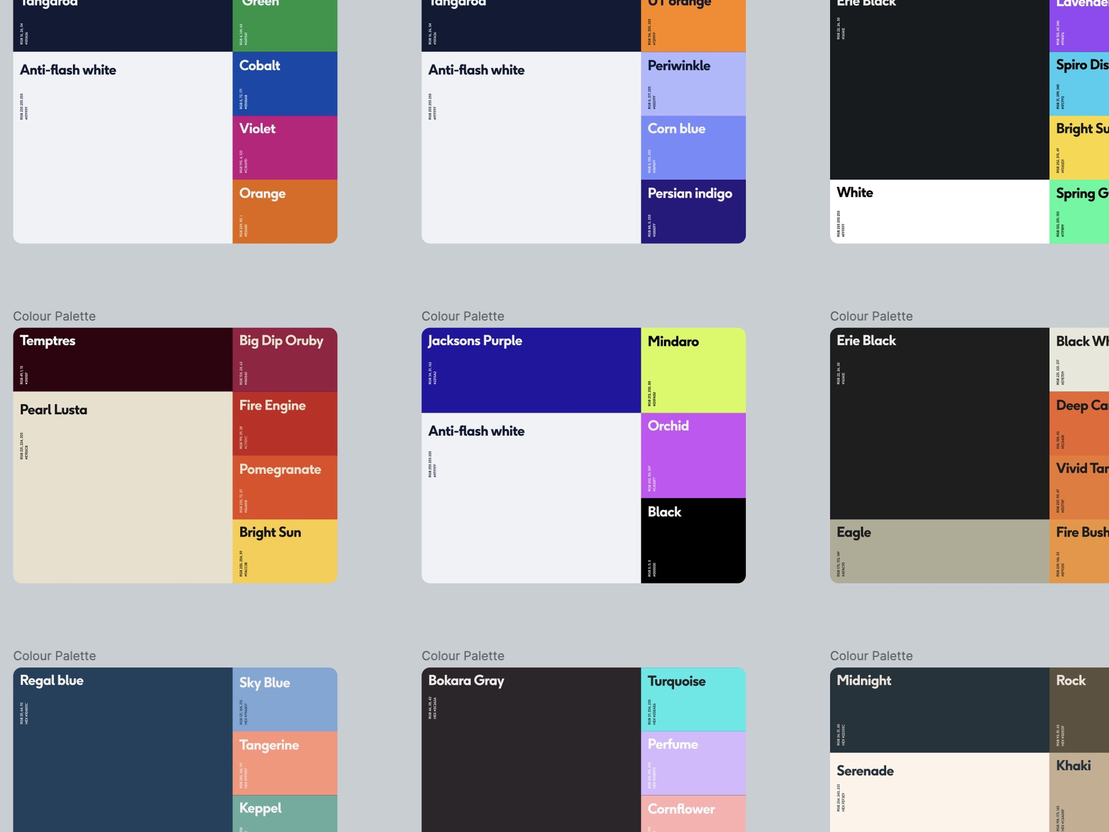
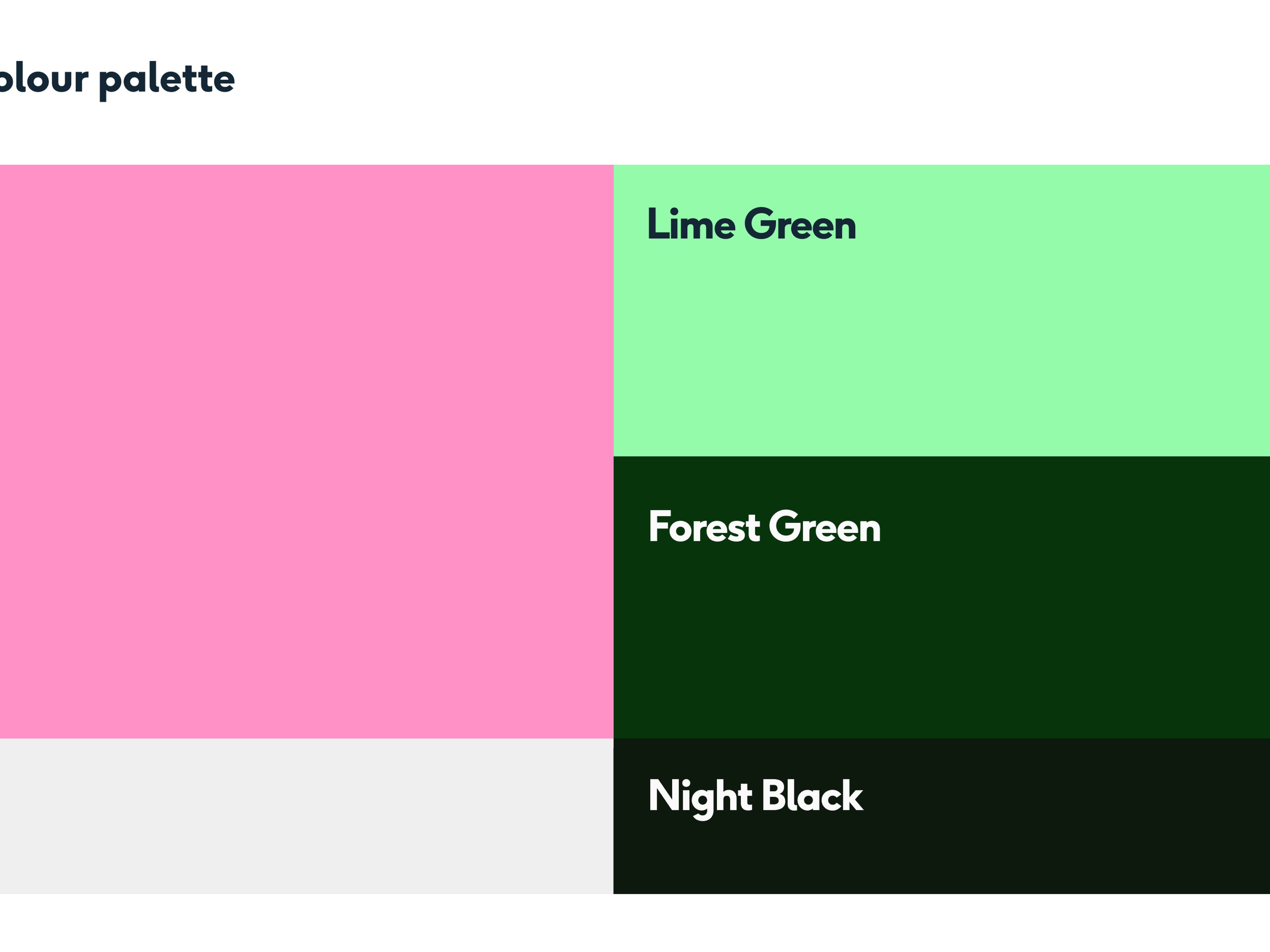
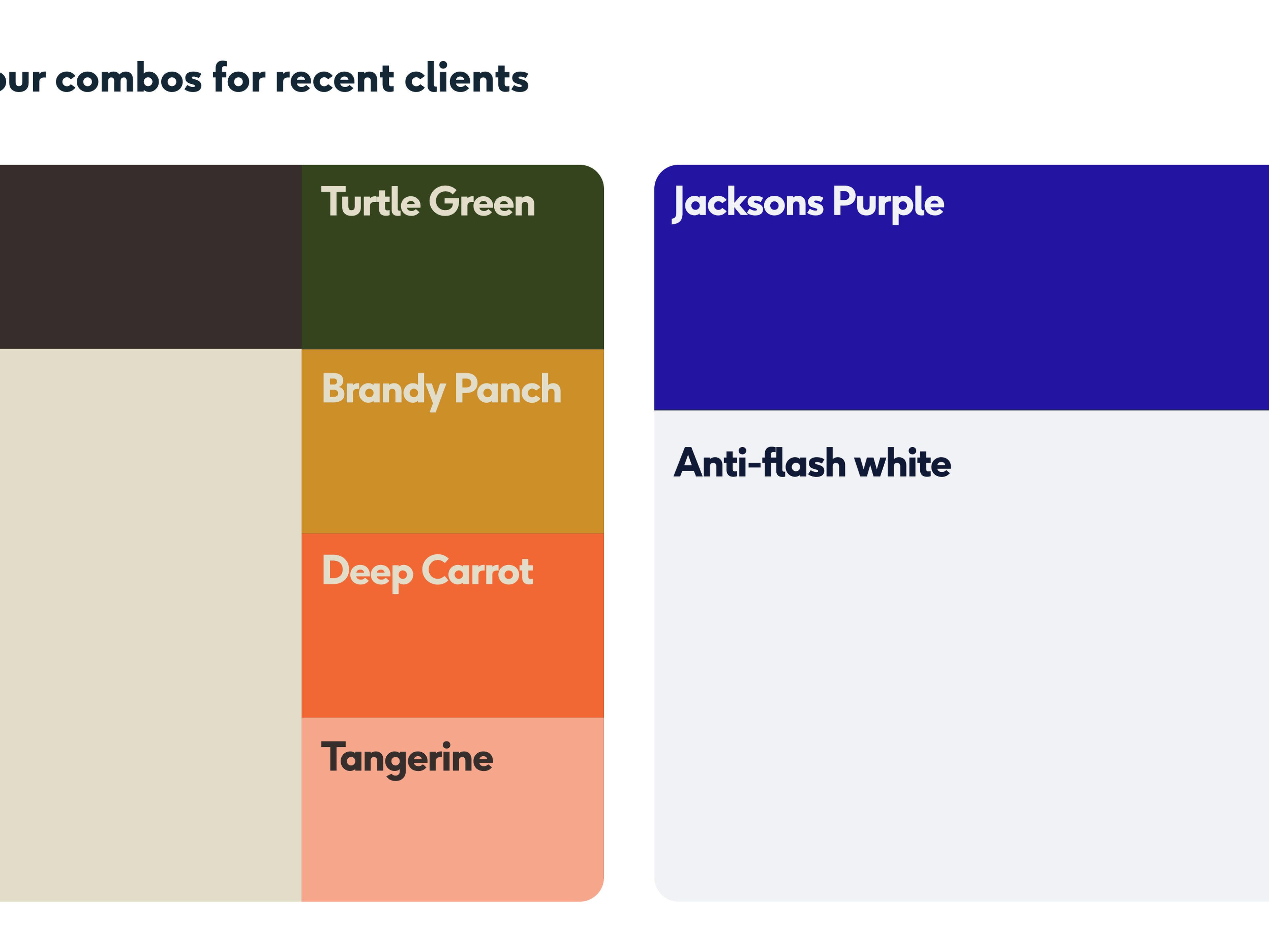
Break away from the competition: A deep dive into your competitors’ colour schemes can show you the gaps. If everyone’s banking on blue for trust, an electric orange could make you look like the innovator. One of our clients in Dubai, designfit, got our full competitor breakdown which led us to find the perfect opportunity colours to make them shine in their market.
Consumer habits at your fingertips: Tools now track what colours grab attention across different platforms. Armed with this data, you can shape packaging, ads, and product designs that hit the mark.
Cultural and seasonal sweet spots: Data can also highlight what colours resonate in specific regions or seasons. Whether it’s the surge of eco-friendly green for sustainability campaigns or the reliable rise of festive red, knowing this keeps you relevant. It also steers you away from politically charged palettes that could cause a misstep.
The bright idea behind every brand
Colour theory isn’t just about making things look pretty – it’s a powerful tool for shaping how people interact with your messaging, and it’s still at the heart of any branding strategy.
Emotional hooks: Colours tap into feelings fast. Red says urgency, blue whispers trust, and yellow beams optimism. Get these base decisions right, and you’ve got an instant bond with your audience.
Brand recognition: People remember colour. Up to 90% of snap judgements are based on it. A consistent palette makes your brand stick in consumers' minds.
Cultural context: Colours can mean different things to different cultures, for example, white may mean mourning in some cultures instead of black. Understanding these nuances helps your brand speak globally.
"Colour analysis is a very easy way to articulate your standing in a market holistically. For example, in some markets, adhering to an established colour palette is a hygiene factor, although there are always subtle ways to stand out. Whereas in other markets, choosing similar colours will remove any competitive edge. Understanding this, as well as the basic human colour associations, will help you craft a brand tailored to your values and commercial plans."
Meredith Howell, Insights & Strategy Manager, Studio East
Colour is far more than a design choice – it’s a strategic asset
When used effectively, colour shapes emotions, builds connections, and boosts brand recognition across different markets and cultures.
While a good grasp of colour theory sets the foundation, pairing it with data-driven insights means that every shade serves a purpose, helping your brand rise above the noise and connect more deeply with your audience through deliberate, informed decisions.
So, when it comes to choosing your brand’s colours, leave nothing to chance. Make each choice count, because the right colours don’t just look good – they drive results.


